Hello, everyone. It's Kou from FHW.
Today, we would like to present part #3 of an in-depth interview with ![]() Quang, the original creator of “Phoenotopia.” The interviewer is
Quang, the original creator of “Phoenotopia.” The interviewer is ![]() Ochoko, "Phoenotopia Strategy Memo. ( フェノトピア攻略メモ。)" blogger who is also considered to be a representative of the Japanese Phoenotopia fans.
Ochoko, "Phoenotopia Strategy Memo. ( フェノトピア攻略メモ。)" blogger who is also considered to be a representative of the Japanese Phoenotopia fans.
Interview list is available here→
フェノトピア開発者様にインタビューさせていただきました!
Interview(#3)
![]() Ochoko I wanted to know if there are any particular characters that you’ve become emotionally attached to? Characters that are not directly related to the main story and not a character on the enemy side, or the like.
Ochoko I wanted to know if there are any particular characters that you’ve become emotionally attached to? Characters that are not directly related to the main story and not a character on the enemy side, or the like.
![]() Quang
Quang
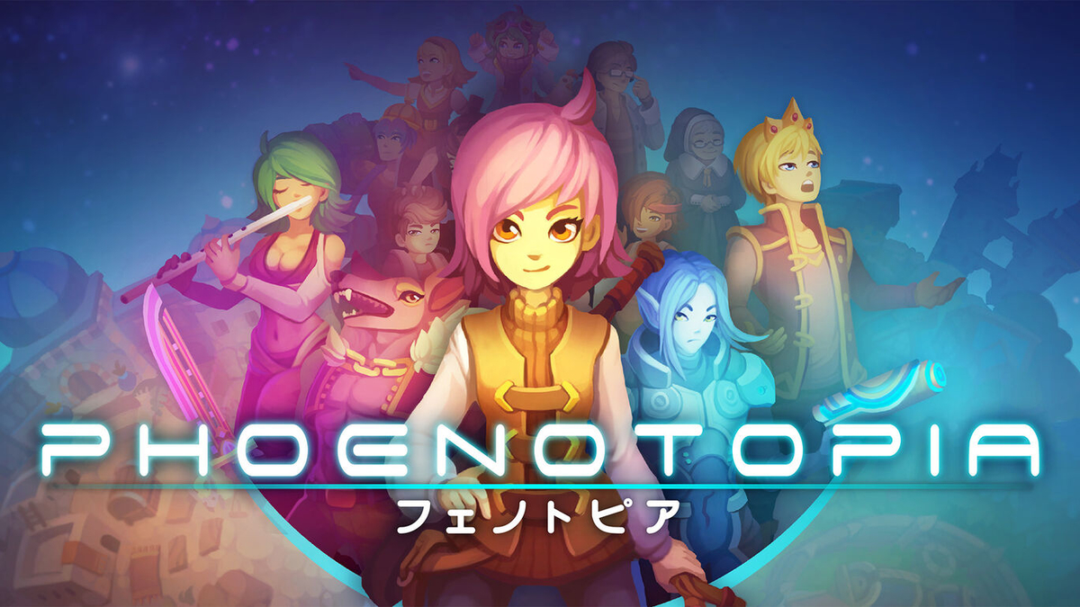
Hmmm... I like writing the silly characters. So I enjoyed writing the orphanage kid Seth and Astrid. Seth's gimmick is that he says something silly that other characters want to whack him for it. Since Astrid covers all the Lunar artifacts, she has a lot of lines - but half of them are likely made up.
Ruby is another one of my favorites for all the zany situations she gets caught in.
I also like Floret, the peace minister. She has an antagonizing relationship with Thomas so I think there's opportunity for a lot of humor there. If I get to create a sequel in the future, I'd like to explore more of her character.
![]() Ochoko The characters are cheerful and lively, largely due to Quang san’s personality.
Ochoko The characters are cheerful and lively, largely due to Quang san’s personality.
By the way, my favorite characters are Prof. Fran and Cobette from the band. For a long time, I wondered….how old is Prof. Fran?
![]() Quang Haha, as for Fran, she's 26.
Quang Haha, as for Fran, she's 26.
![]() Ochoko
Ochoko
Prof. Fran is 26…
Honestly, I thought she was older than that (Haha)!
![]() Quang Haha, depending on when you had asked me I'd likely have had a different answer regarding the character's ages. Character ages and other details are all ambiguous and vague in my head until it comes up in the script. When it does, that's when I have to decide definitively.
Quang Haha, depending on when you had asked me I'd likely have had a different answer regarding the character's ages. Character ages and other details are all ambiguous and vague in my head until it comes up in the script. When it does, that's when I have to decide definitively.
#
![]() Ochoko From this point, I want to ask about design and artwork-related questions.
Ochoko From this point, I want to ask about design and artwork-related questions.
Compared to the FLASH version, some significant changes have been made to the game design.
Particularly “Moonlight Ravine” stands out to me the most.
Is there any reason why you change that stage to be such a vividly colorful stage?

![]() Ochoko Also, there are color ring pictures in the Gallery mode, which shows that the color of the stages is lined up as the color hue wheel chart.
Ochoko Also, there are color ring pictures in the Gallery mode, which shows that the color of the stages is lined up as the color hue wheel chart.
The picture is very beautiful and remains to be impressive.
I would love to hear more about the decisions made for determining the color schemes for the stages and some of the pros and cons of selecting the colors.

![]() Quang
Quang
The game had a very long development time (6+ years) and the game also wasn't built in chronological order. So, regarding Moonlight Ravine, it was one of the early areas. And early in development, we had the idea that the game should be faithful to the FLASH version, so it was made looking very similar initially. However, as we developed the game more and more, and the years passed, our skills and drawing ability also improved. And the things that we made early in development started to look outdated and needed to be improved, so that's what we did. It was a big concern I had about the development. I was very worried about Gail in particular, since she started to look simplistic compared to the later NPCs. I was afraid there would be an art style clash. But Gail could not be changed since she has too many animations - we were stuck with her initial sprite design, haha.
So Moonlight Ravine went through this improvement process. I think Moonlight Ravine just happened to get extra lucky. The Musician (Will Cho) had finished a new beautiful soundtrack, I wanted to really push the swimming and fishing aspects, and the artist (Anna) had chosen a beautiful set of colors for it - it was a lot of all the right elements coalescing together to result in Moonlight Ravine.
![]() Ochoko Moonlight Ravine is charming, and it’s hard to describe in just a few words, but it seems that under these circumstances, it was reborn. Many people often mention it as one of the lovely sightseeing hotspots in their post-play impressions.
Ochoko Moonlight Ravine is charming, and it’s hard to describe in just a few words, but it seems that under these circumstances, it was reborn. Many people often mention it as one of the lovely sightseeing hotspots in their post-play impressions.
![]() Quang
Quang
Regarding the color schemes for other areas, I remember reading an interview a long time ago for Diablo 2. The developer said that based on their player testing, they determined that you need to switch up the areas every 45 minutes to prevent the player from getting visually bored of an area. So that's something we kept in mind - we wanted every area to have a unique identity. Then the artist Anna had the idea to put the areas on a color wheel, and that way, we could see what color schemes we have yet to hit. So you can credit Anna for that very novel approach to how the areas should be color coded.
Hitting that great variety of colors in the areas was definitely tough though. The characters don't have a dark pixel outline like in other games, so visibility was always an issue. Every time we placed an NPC or object of interest on the screen, we'd have to mind the readability. We do this trick where we'll place a circular gradient shadow behind an NPC or object of interest to make it stand out from its environment. We'd have to adjust the size, the alpha, and the color of these gradient shadows every time! So it was a lot of work - but I hear people think the game looks lovely, so it was worth it!
![]() Ochoko I am learning a lot as you talk about visually switching things up and visibility.
Ochoko I am learning a lot as you talk about visually switching things up and visibility.
While I’m at it, I’d like to ask you a design-related question…(To be continued in #4)
Afterwords
So what do you think of「Phoenotopia」Long Interview#3?
Here are the Phoeotopia: Awakening store pages. Feel free to check them out if you are interested!